An ecommerce agency developing high-performing online stores powered by Magento, Adobe Commerce, Shopify, and Shopware.
We rebranded the business to reflect the company it’s become — mature, focused, and built for what’s next.
The first iteration launched in August 2025, with ongoing refinement as the brand grows alongside the company.

The client’s identity carried history — but it was time for a change.
Since 2012, the brand had relied on a single logo and its signature orange. The business grew, the projects got bigger — but the brand stayed the same. The goal was simple: build a clear, confident identity that reflects where the company stands today and where it’s heading next.
The client had been seen as a Magento-first agency for years, but the landscape shifted. Magento Enterprise became Adobe Commerce, and the company expanded into Shopify and Shopware. The new identity needed to show that change — keeping its Magento roots, but opening the door to a wider ecommerce world.
The result is a brand that looks like the company it has become — experienced, adaptable, and ready for what’s next.
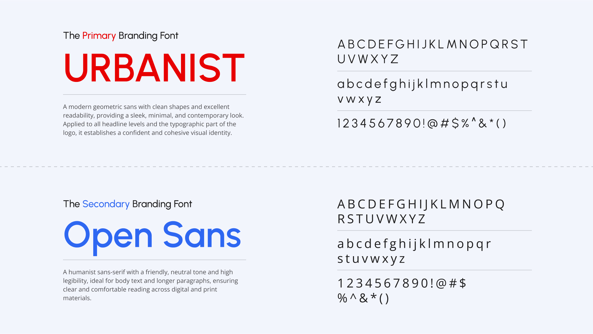
Logo design
Visual identity
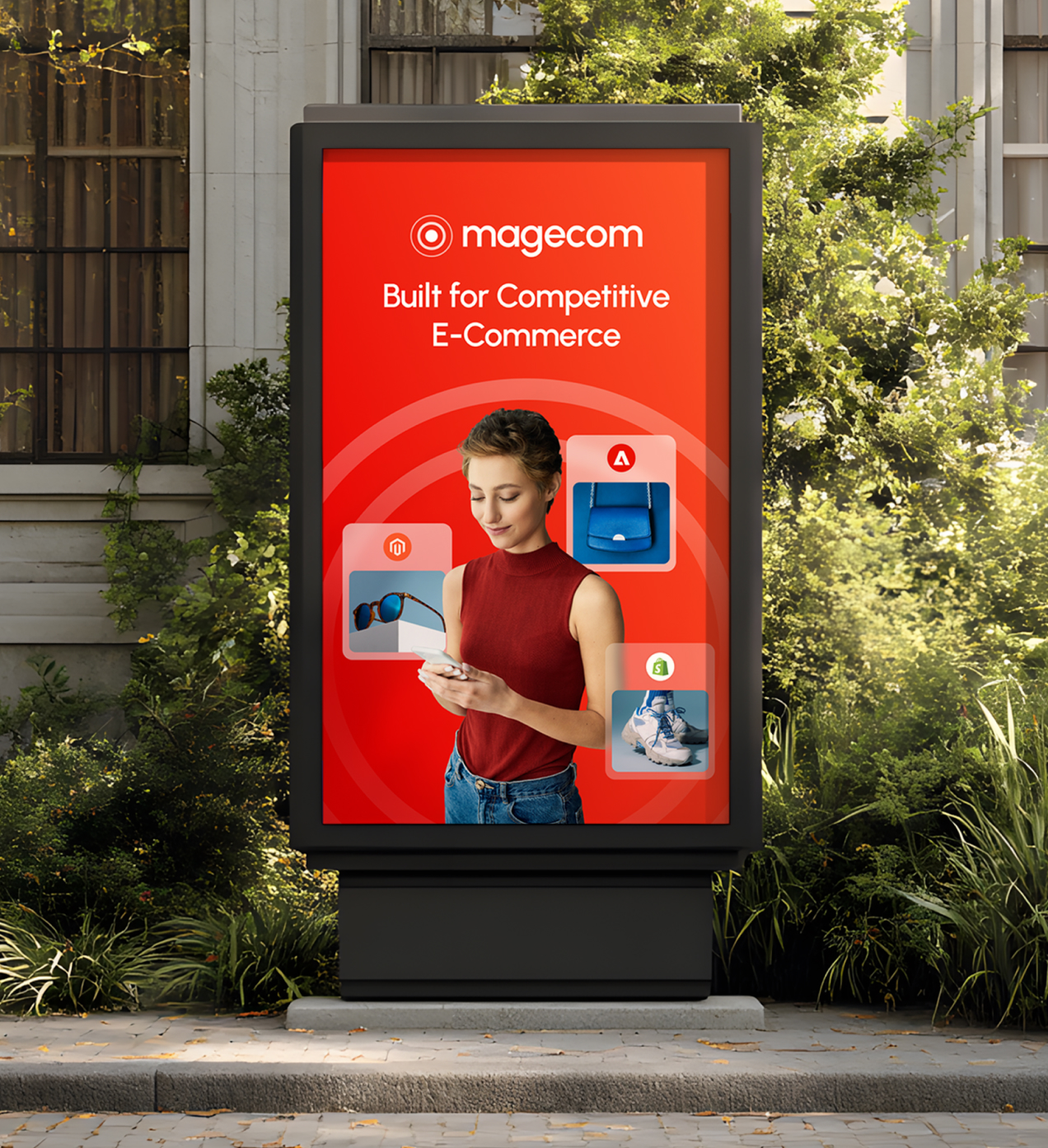
Sales & marketing assets design
Merchandise design
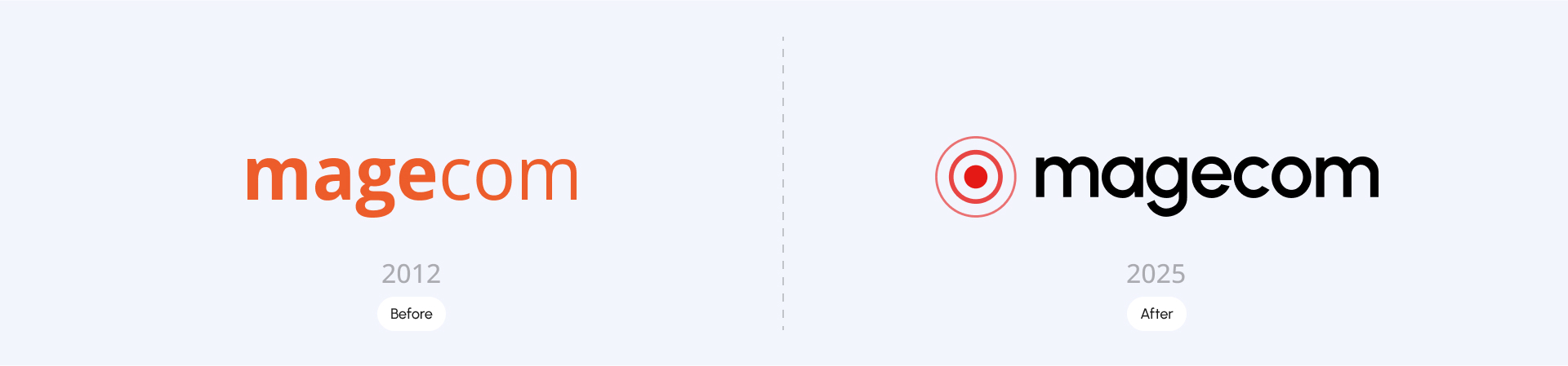
The client helps businesses navigate change — and the new logo makes that clear.
The mark takes the shape of a target, a simple reminder of focus and direction.
It’s about setting goals and hitting them — the same way the agency works with its clients.
Nothing extra. Just purpose, precision, and progress.

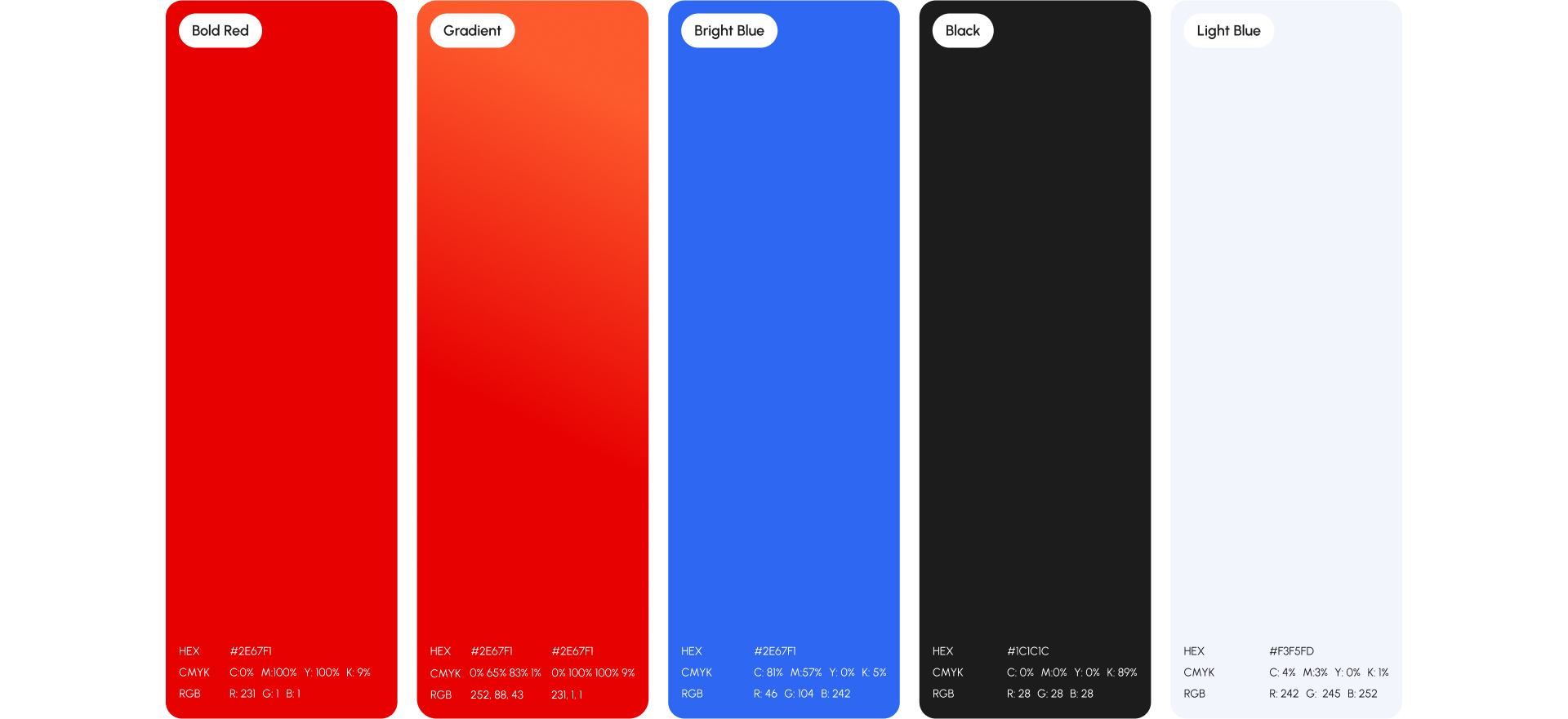
We built a color palette that hits the balance between bold and professional. It stands out without shouting — confident, but still grounded.
Every color has a reason. Together, they build a palette that’s distinct, functional, and unmistakably the client.
The new visual language builds on the simplicity of the logo. Circles — taken from the logomark — become the foundation of agency’s graphic system.
They act as anchors, connecting imagery, layouts, and key messages. Sometimes they highlight focus points in photography; other times, they guide the eye through motion or composition.
The use of imagery follows the same principle — clarity over clutter. Photography is direct, professional, and grounded in real work, not staged perfection. It reflects the people, technology, and process that drive the agency forward.

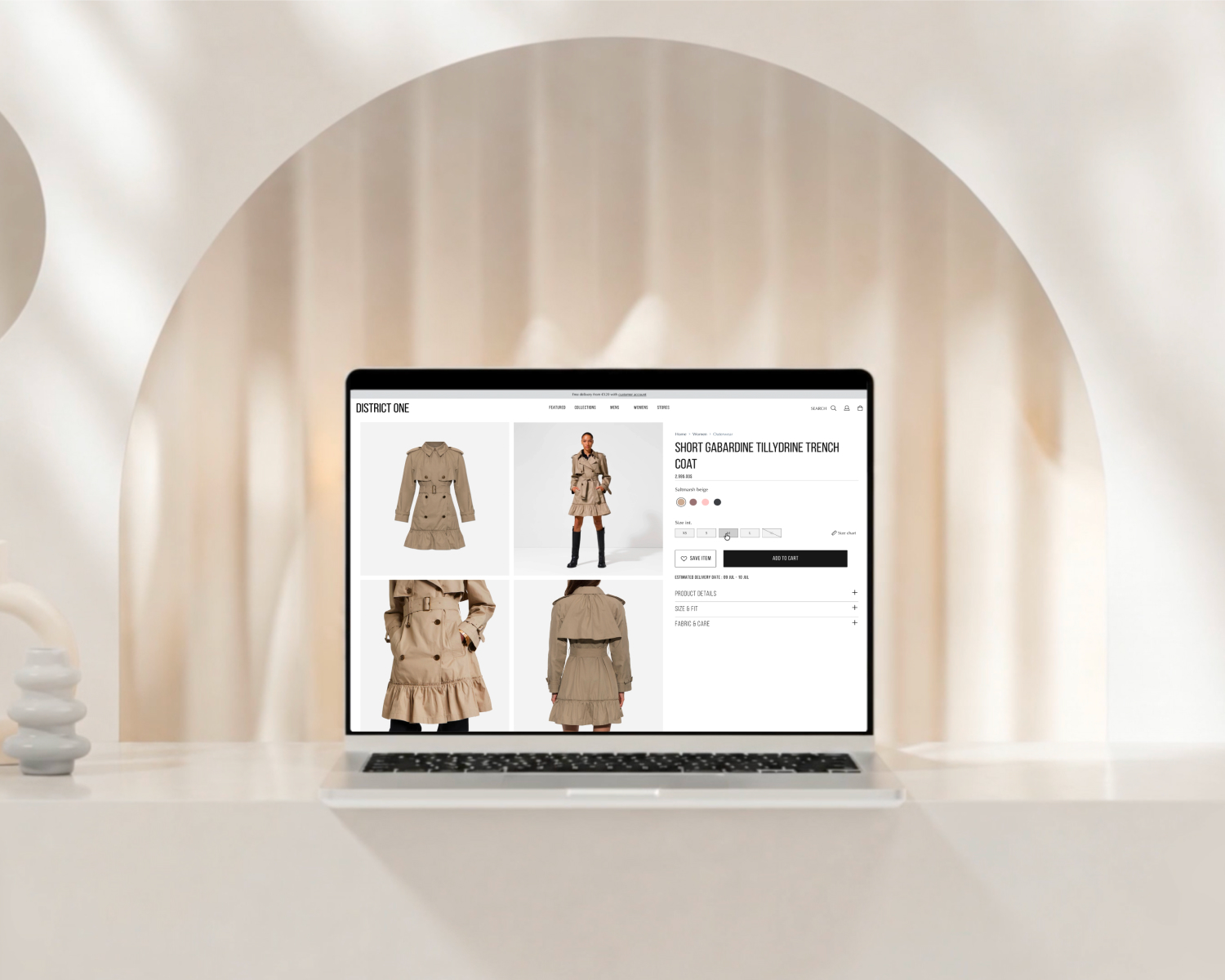
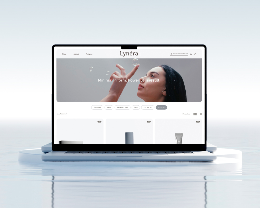
The new identity extends naturally across client’s marketing materials — from sales decks to case studies and social content.
Every asset is built for clarity and consistency, making it easy for the team to communicate with confidence.
The system relies on strong typography, clean layouts, and purposeful use of color and motion — no decoration, just design that supports the message.
It’s a toolkit made for growth — flexible enough for day-to-day use, sharp enough to make an impact in every client conversation.
A cohesive visual system – transformed from a decade-old logo into a future-ready system that reflects who the client is today.
Modernized look and feel – a refined aesthetic that balances corporate confidence with fresh, contemporary energy.
Distinct color language – introduced a powerful palette where every tone supports clarity, recognition, and emotional impact.
Dynamic digital presence – a visually engaging website built around storytelling, motion, and seamless user experience.
Consistent brand expression – from stationery to merchandise, every visual element now feels connected, intentional, and unmistakably Magecom.
“Working with Emmmotion has been an excellent experience. The team handled our very specific, pixel-perfect requirements with professionalism and agility, always staying open and responsive throughout the process. They created an atmosphere of creativity and transparent collaboration, constantly searching for the best possible solution rather than just the fastest one. I truly see Emmmotion as an extension of our own team, aligned with our bigger goals and standards. Design is a subtle balance between emotion and skill - and that’s exactly where Emmmotion excels.”