A leading Spanish ecommerce agency driving growth for mid-size and enterprise brands across local and international markets.
We repositioned the brand for global relevance, aligning its identity with ambitious growth goals and a broader audience.
A multi-layered transformation spanning research, positioning, rebranding, and a full website launch – executed with precision end-to-end.

Interactiv4 had already built the foundations for international growth: robust processes, proven solutions, and a strong operational core. What was missing was how the brand showed up externally.
The objective was clear: evolve from a Spain-focused perception into a globally relevant eCommerce partner. This meant redefining positioning, sharpening messaging, and aligning the company’s presentation with its true capabilities and ambitions.
Following in-depth research, we crafted a new positioning – “Your ecommerce partner for local and global growth” – and translated it into a cohesive visual identity designed to elevate perception, attract international clients, and support the company’s next stage of expansion.
Positioning
Rebranding
Marketing assets creation
Website development
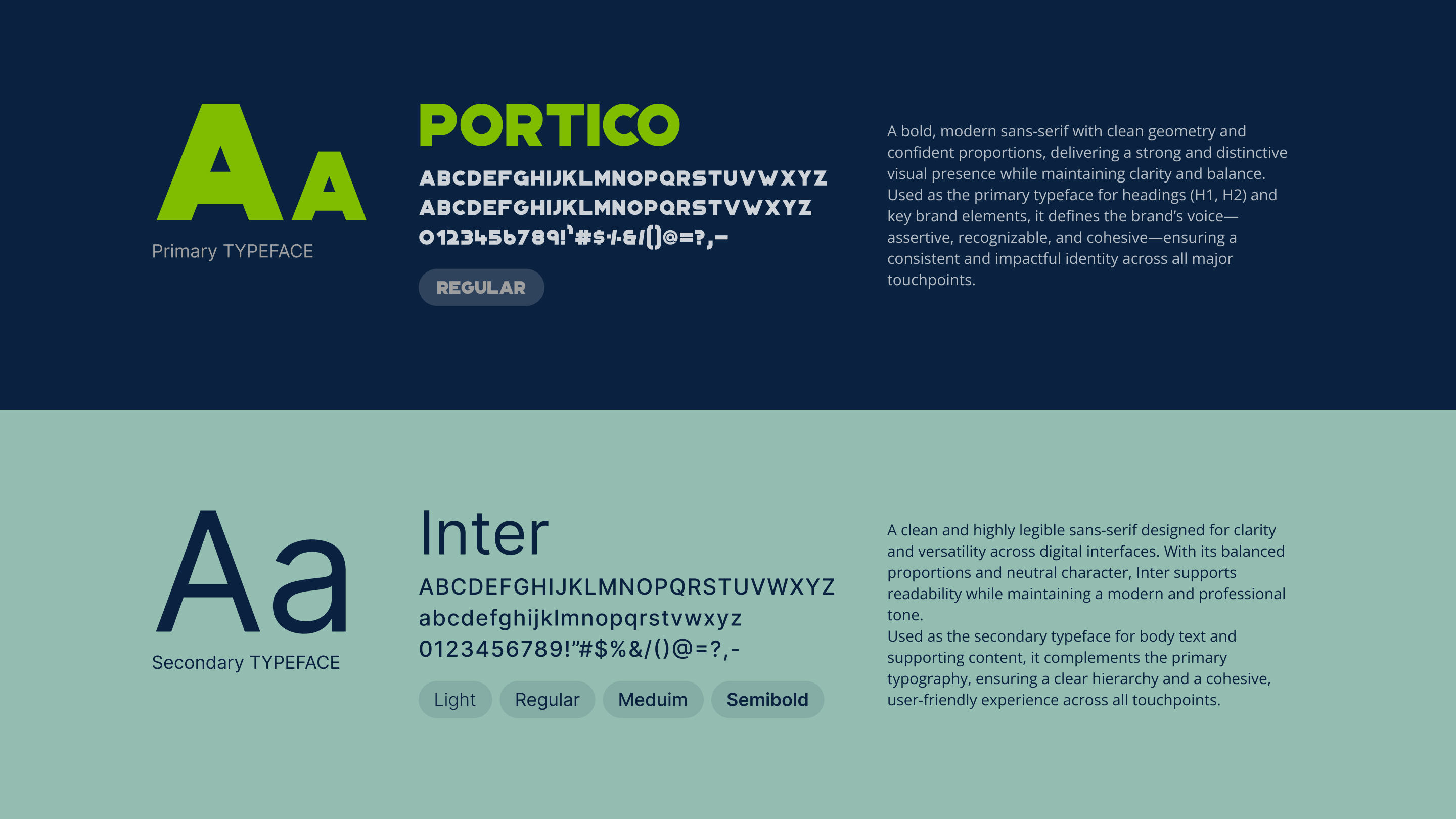
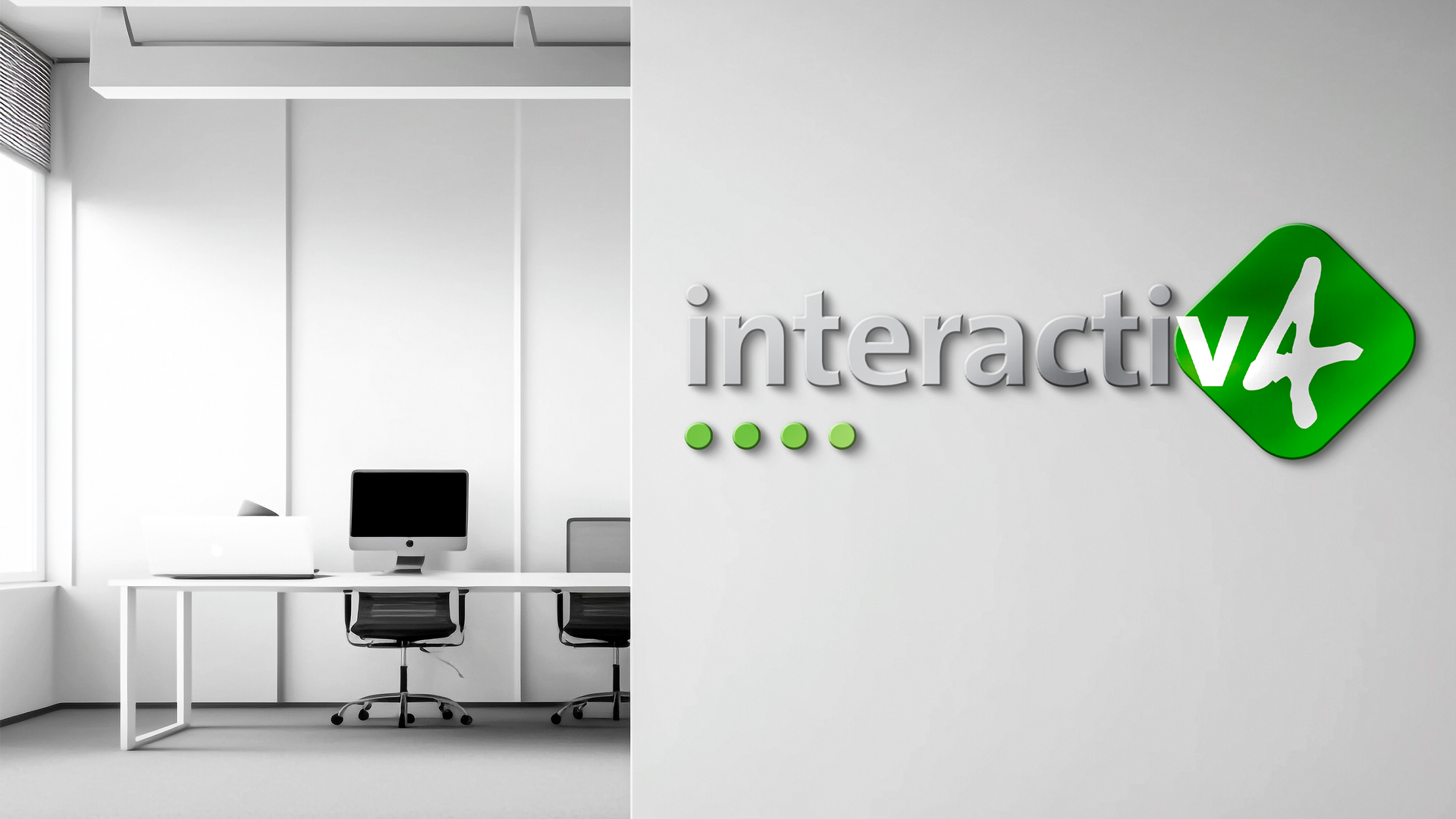
The logo evolution builds on what already worked preserving the recognisable DNA while refining its expression through an updated color palette. Rather than reinventing, the goal was to elevate.
The iconic green symbol remains the core anchor, representing innovation, forward movement, and a strong digital foundation. Its geometric form continues to convey structure and precision, qualities deeply embedded in Interactiv4’s approach to ecommerce.
With the refreshed palette, the mark gains a more contemporary and international feel, enhancing visibility and adaptability across digital touchpoints. The balance between the symbol and typography reinforces clarity and confidence, ensuring the brand feels both established and ready for what’s next.
The result is a logo that stays true to its roots, but now speaks with greater ambition, clarity, and global intent.
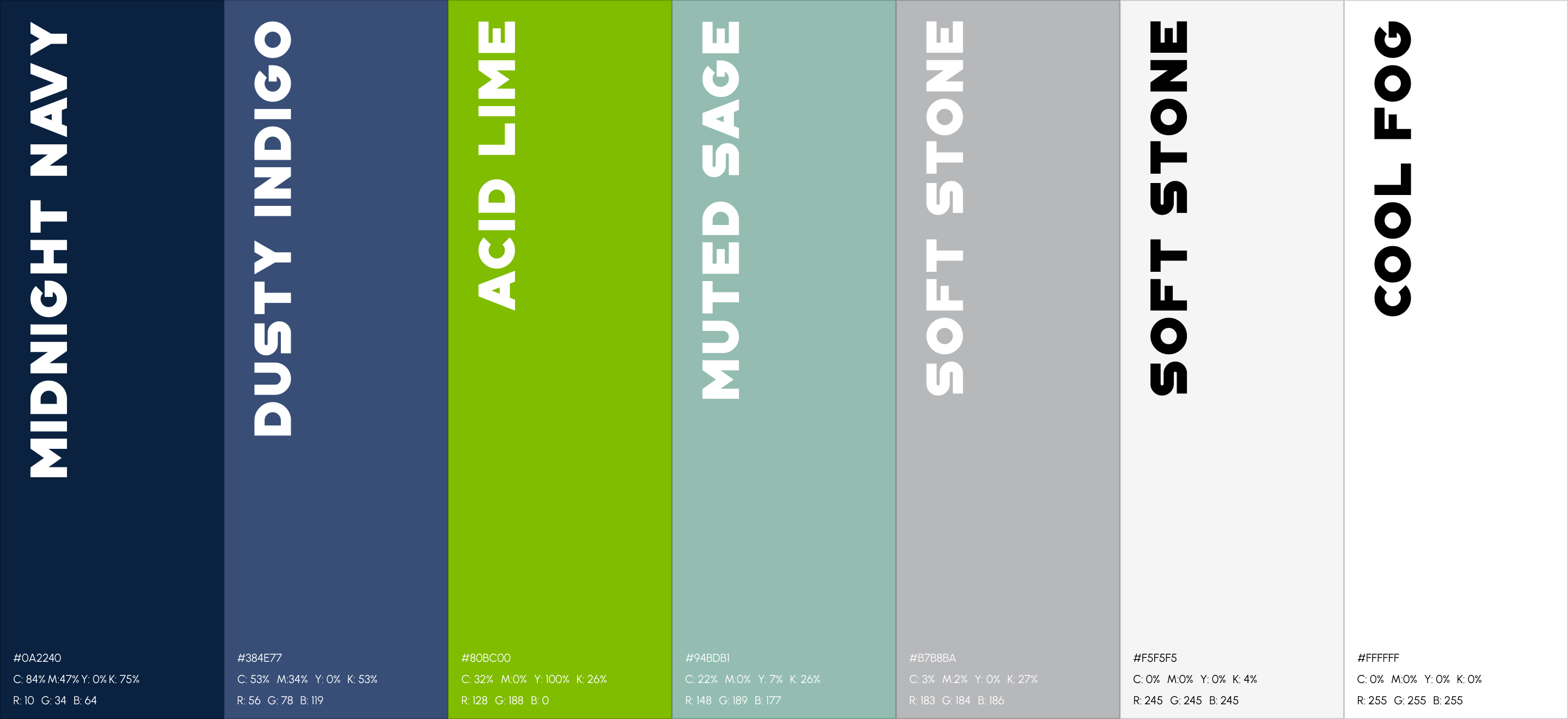
We built a color palette that reflects Interactiv4’s evolution – from a strong local player to a brand ready for global growth. It balances trust, clarity, and momentum.
Deep Navy leads the system. It represents expertise, reliability, and strategic thinking – anchoring the brand in confidence and enterprise credibility.
Vibrant Green injects energy and intent. It signals growth, innovation, and forward movement – a clear expression of the brand’s ambition to scale beyond borders.
Dark Slate Blue provides depth and structure. It supports the system across digital environments, adding stability while maintaining a modern, tech-driven feel.
Light Grey and soft neutrals bring clarity and space. They keep the identity clean, adaptable, and easy to navigate – ensuring the message always stands out.
Every color has a purpose. Together they create a palette that feels sharp, scalable, and ready to perform on an international stage.
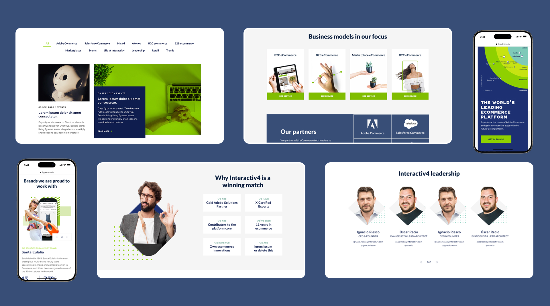
The visual system is designed to scale across touchpoints, markets, and stages of growth. From website to marketing assets, every element works together to create a clear and consistent brand experience.
At the core lies a structured approach. All services are organized into three distinct stages – STRATEGIZE, BUILD, GROW – reflecting where clients are in their journey and guiding them forward with clarity and intent.
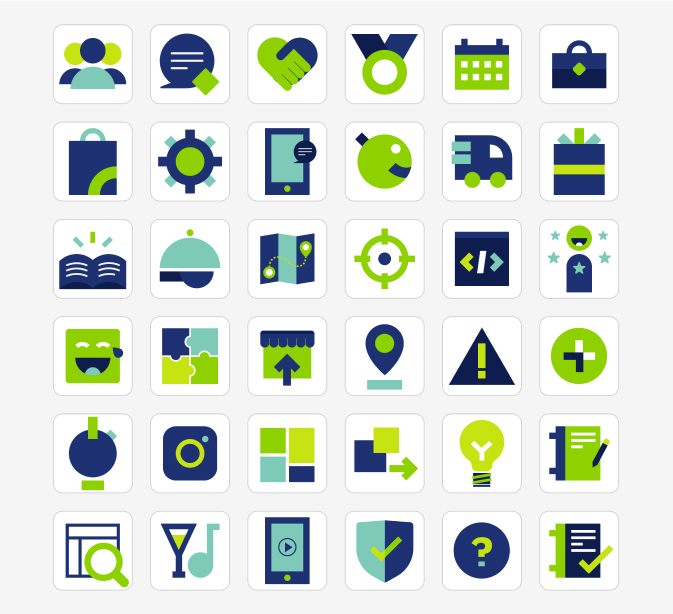
Each service is brought to life through a unique visual metaphor. Every image tells its own story, translating complex offerings into simple, engaging ideas. While each concept stands on its own, the system remains cohesive, unified through color, composition, and a consistent visual language.
The style balances clarity with expression. Clean layouts, strong contrasts, and purposeful use of color ensure the message cuts through, while the visuals add depth and memorability.
To maintain consistency, we developed a comprehensive brand style guide – a practical toolkit that defines how the system comes to life across all applications, ensuring the brand stays sharp, scalable, and instantly recognizable as it grows.
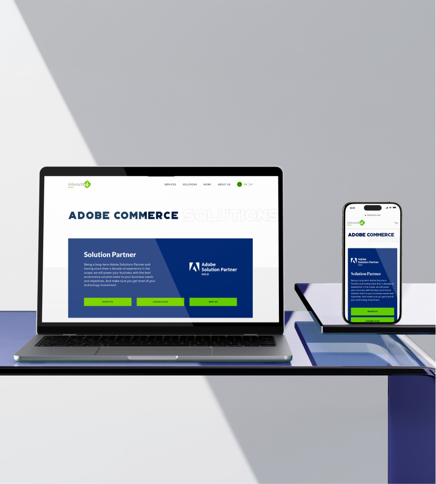
A key part of the project was the full implementation of the new website on WordPress – built with one clear goal: give the team full control. Content editors can now create, update, and scale pages independently, without relying on developers.
The platform was designed for flexibility at scale. Over 50 unique pages were crafted – covering services, business models, and in-depth case studies showcasing client work – all structured to deliver clarity while supporting complex content needs.
Beyond the website, the transformation extended across every touchpoint. Corporate presentations, social media templates, internal materials, and more were fully redesigned to align with the new identity.
The result is more than a website – it’s a complete, scalable system that empowers the team to communicate, adapt, and grow with consistency and speed.
Clear international positioning helped Interactiv4 evolve from a locally perceived agency into a brand ready to attract global clients and opportunities.
Refined visual identity introduced an updated color system and refreshed branding that better reflects the company’s ambition, maturity, and expertise.
Consistent brand experience aligned every touchpoint from website to presentations, sales materials, and social media assets under one cohesive system.
Scalable WordPress website delivered a flexible digital platform with over 20 unique pages and full independence for the internal content team.
Stronger internal culture extended the rebrand beyond marketing through custom merchandise and branded materials designed to strengthen team identity and company presence.