Lynéra is a premium skincare brand – minimal in form, powerful in performance, and built for visual-driven customers.
We created a refined logo, a complete brand identity, and a packaging system designed to elevate the product experience.
Delivered end-to-end within one month – from concept to execution – building a cohesive brand ready to launch, scale, and stand out from day one.

Lynéra was created as a new skincare brand with a clear vision to combine clean aesthetics with a premium, modern feel. Starting from zero, the goal was to build an identity that feels simple, refined, and instantly recognizable.
The challenge was to create a brand that stands out through subtlety balancing minimal design with a strong presence. It needed to feel elevated yet accessible, aligning visual clarity with product performance.
The result is a cohesive identity designed to launch Lynéra with confidence, built to scale, connect, and grow in a highly competitive skincare market.
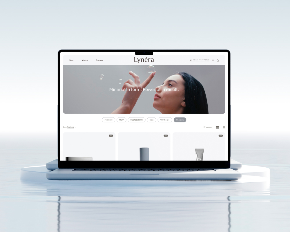
Logo design
Visual identity
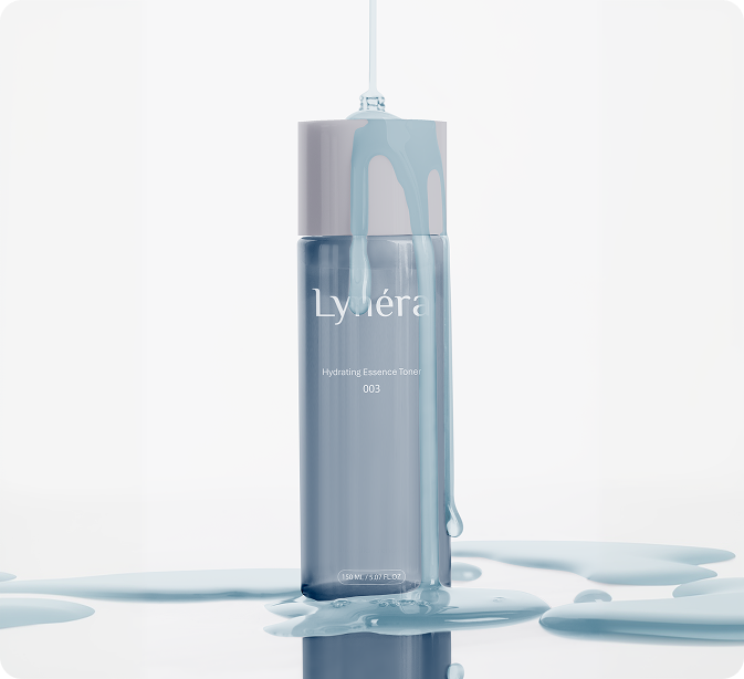
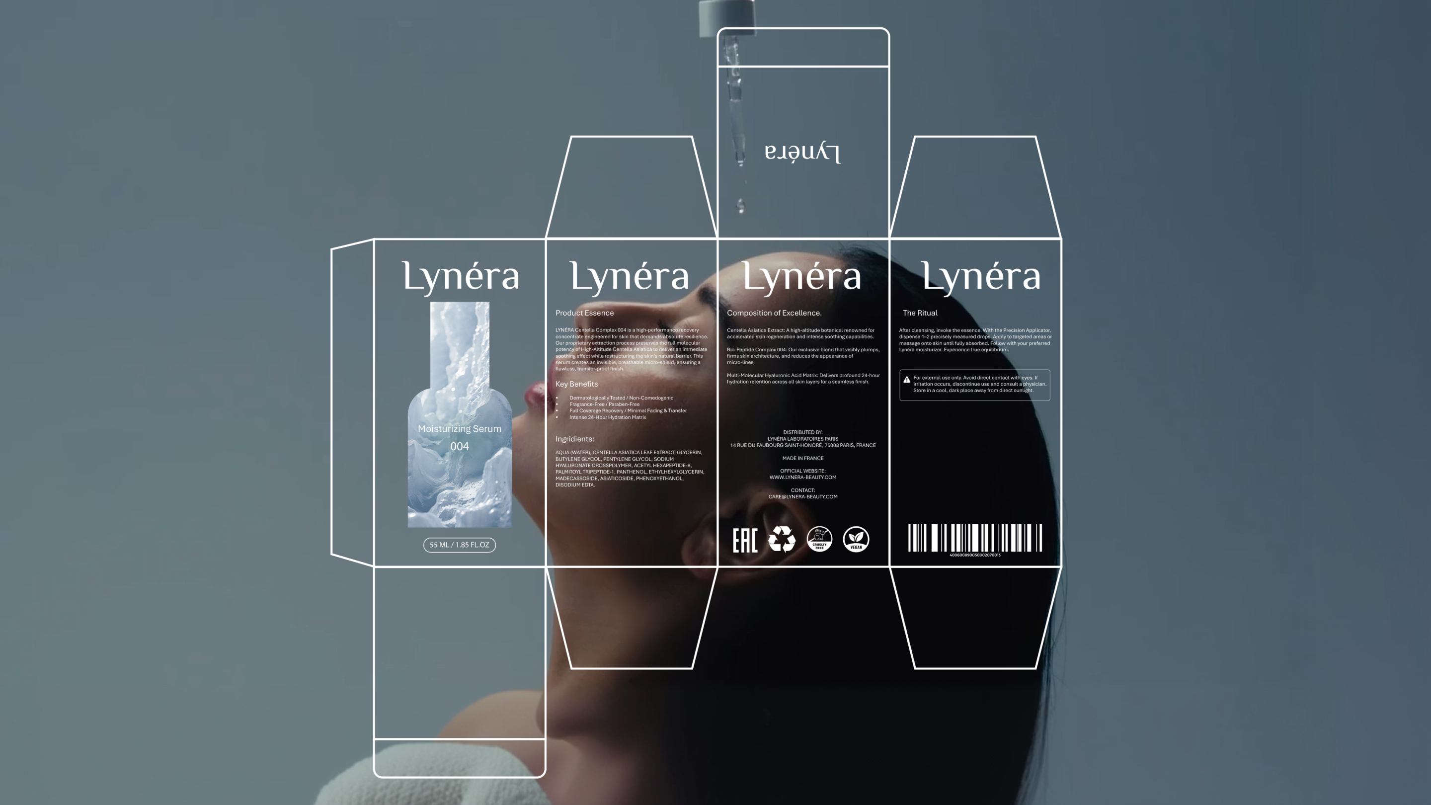
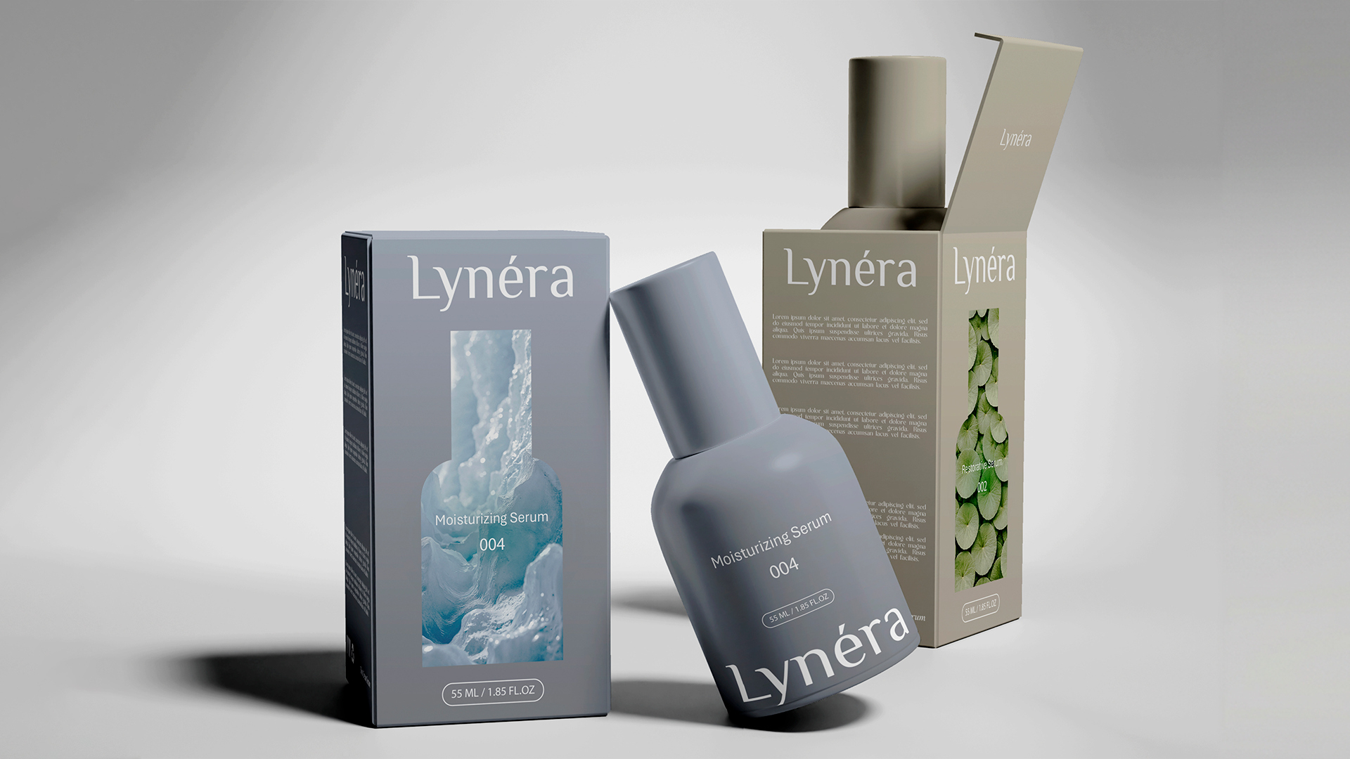
Packaging design
Marketing assets design
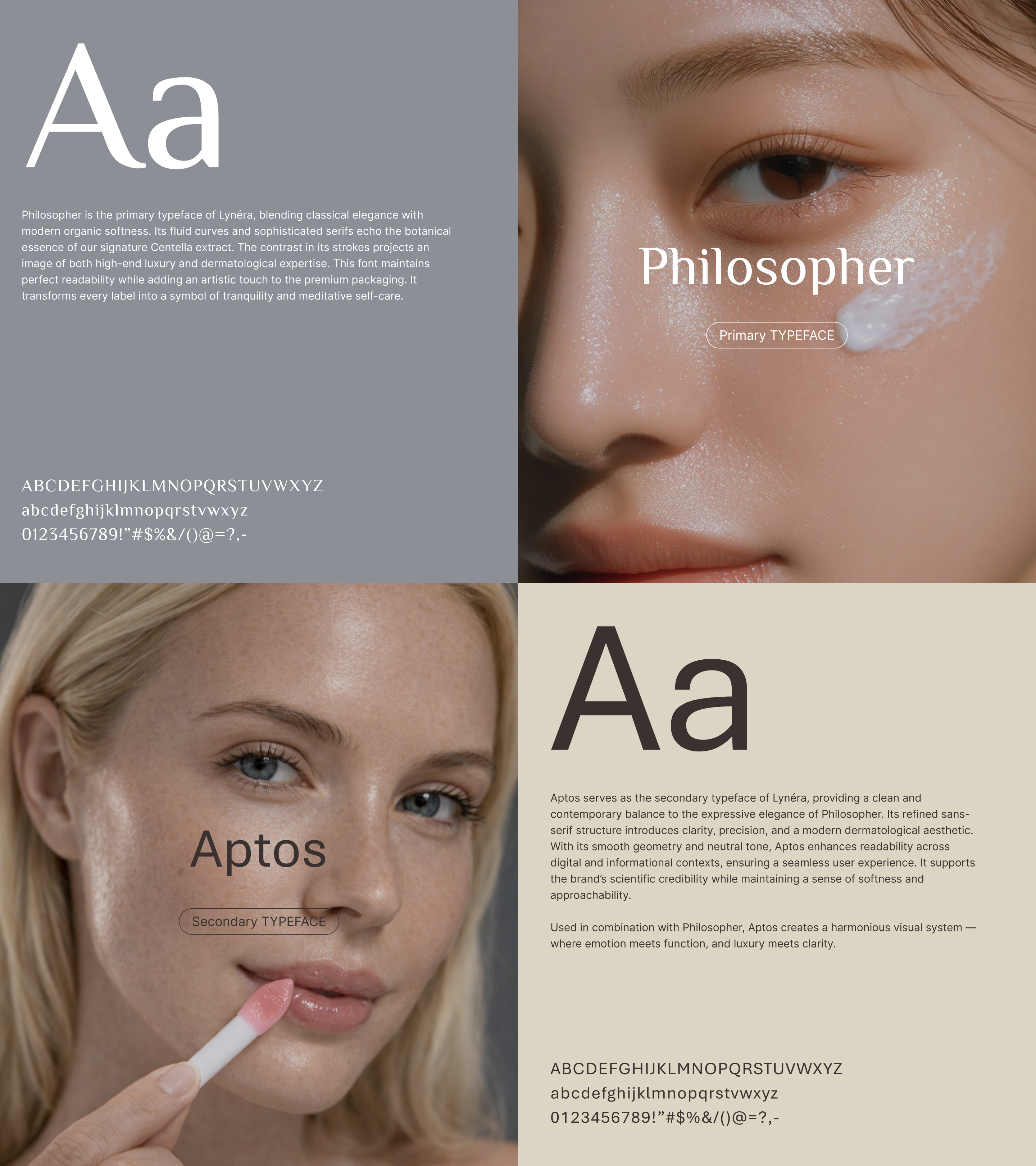
The Lynéra logo is built on elegance through simplicity. A refined serif wordmark that feels timeless, yet distinctly modern, designed to sit effortlessly within the world of luxury skincare.
The typography carries the identity. High contrast strokes and delicate curves create a sense of precision and care, echoing the balance between science and aesthetics. Every detail is intentional, allowing the logo to feel soft, elevated, and quietly confident.
The accent on “é” becomes a defining feature, a subtle but distinctive gesture that adds character and memorability without disrupting the minimal form.
Set against clean, natural imagery, the logo integrates seamlessly into the brand’s visual language. It doesn’t compete for attention, it enhances it.
The result is a mark that feels understated yet unmistakable – designed to age gracefully as the brand grows.
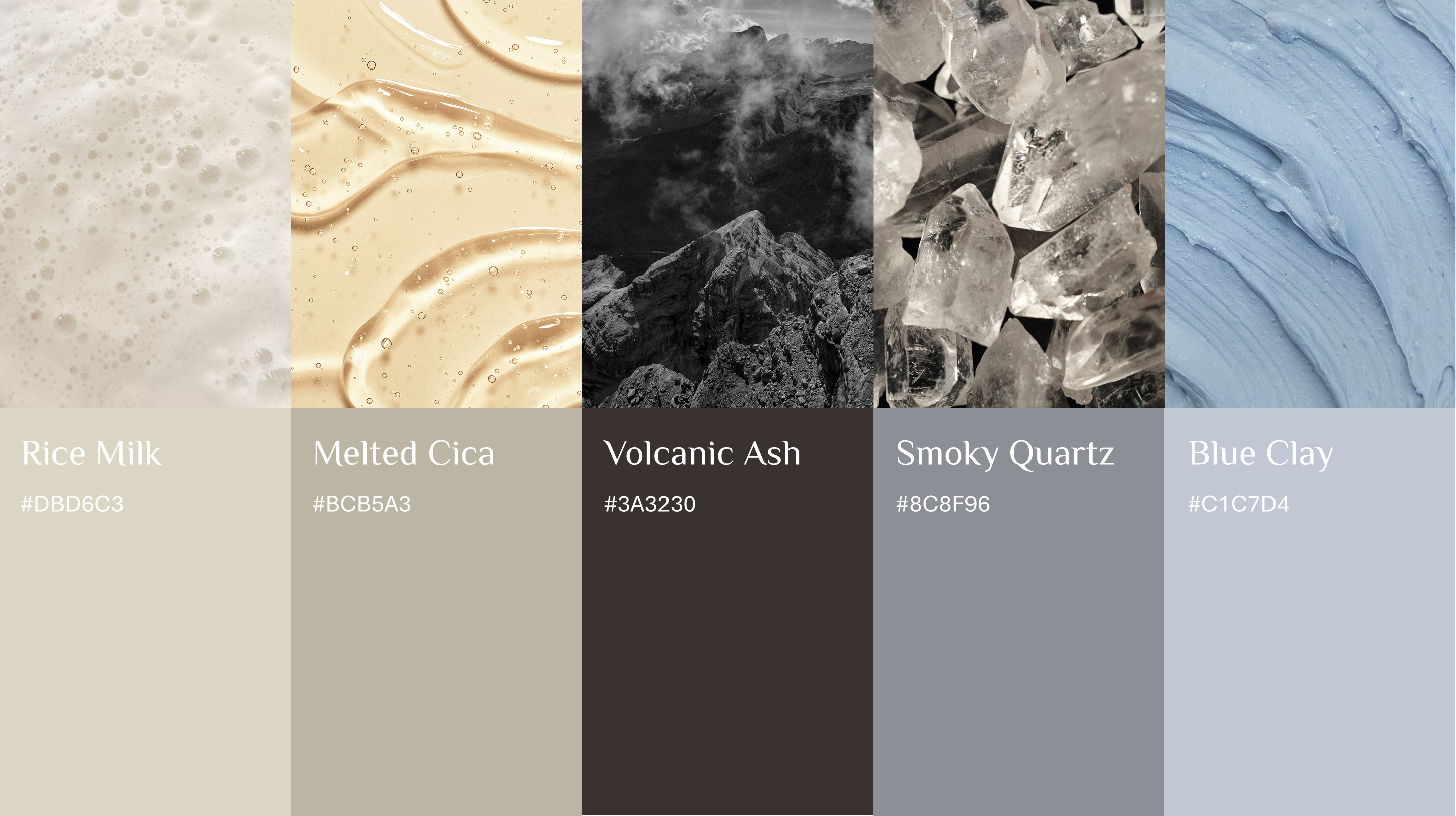
We built a color palette that reflects the dual nature of modern skincare – where nature meets science, and softness meets performance. It balances warmth, clarity, and depth to create a refined and sensorial brand experience.
Rice Milk sets the foundation. A soft, creamy neutral that evokes purity and care – creating space for the product to breathe while establishing a clean, minimal base.
Melted Cica introduces warmth. Inspired by nourishing ingredients, it brings a subtle glow to the system – reinforcing comfort, repair, and skin-focused benefits.
Volcanic Ash anchors the identity. Deep and grounded, it adds contrast and sophistication – a reminder of strength, transformation, and high-performance formulations.
Smoky Quartz provides balance. A muted, modern grey that bridges light and dark – ensuring versatility across packaging and digital applications.
Blue Clay adds a fresh accent. Cool and calming, it reflects skincare textures and treatments – bringing a sense of clarity, hydration, and renewal.
Every color has a role. Together they create a palette that feels tactile, elevated, and alive – designed to be both seen and felt.
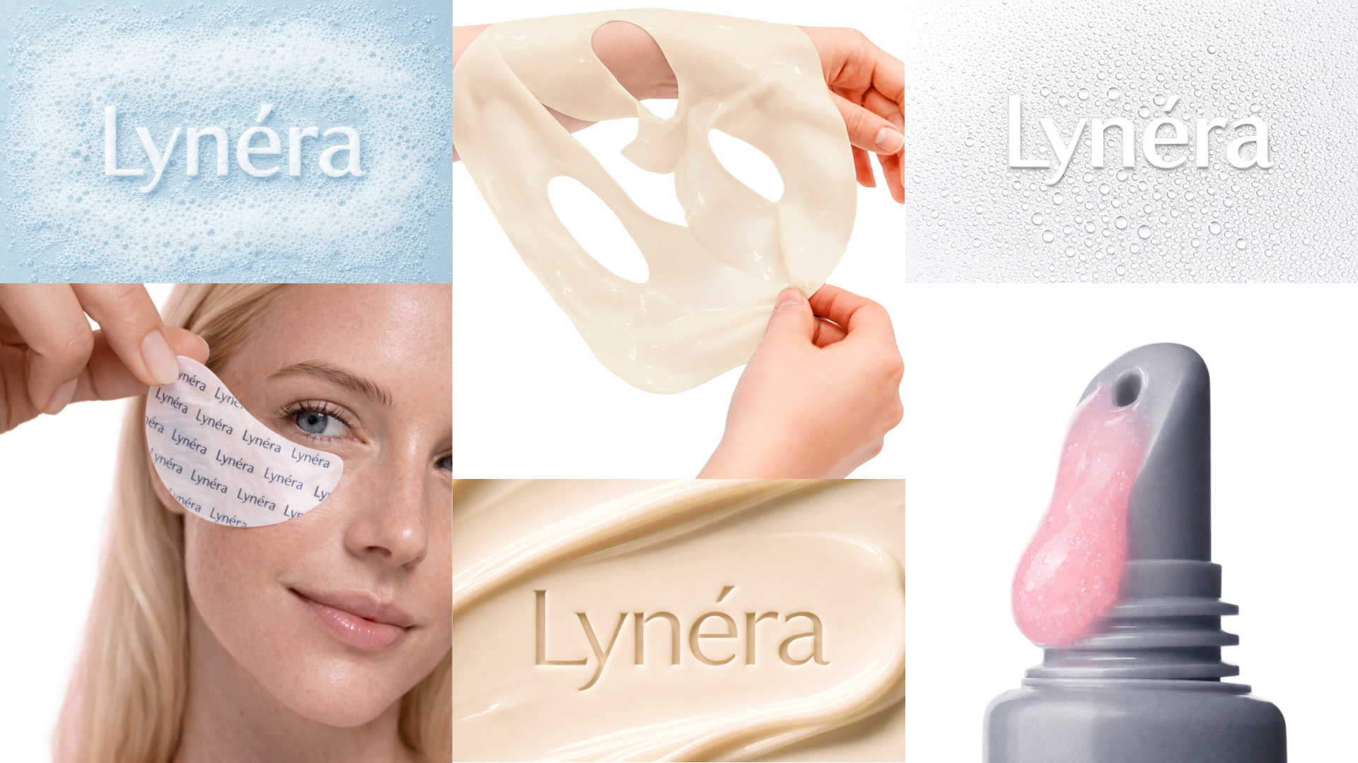
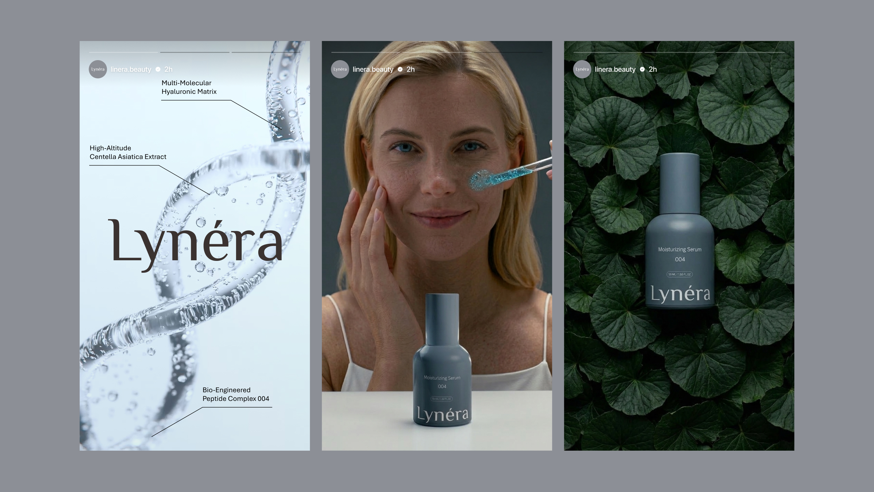
The visual language of Lynéra is built around clarity, softness, and control. Every composition feels intentional: nothing excessive, nothing accidental.
The system moves between two worlds. On one side, clean, clinical visuals – ingredients, textures, and formulations – communicate efficacy and trust. On the other, natural elements and human touch – skin, plants, subtle gestures – bring warmth and emotion into the brand.
Lighting plays a key role. Soft, diffused tones create a calm and refined atmosphere, allowing textures to stand out while keeping the overall aesthetic minimal and elevated.
Composition is simple and focused. Products are centered, framed with space, and never competing with their surroundings. Whether placed against natural backdrops or neutral environments, they remain the hero.
The result is a visual style that feels balanced. Scientific yet sensorial, minimal yet expressive. Designed to make the brand not just seen, but felt.
A strong brand foundation – built Lynéra from the ground up with a clear, premium identity ready to launch and scale.
Distinct visual presence – created a refined logo and aesthetic that stands out through simplicity and quiet confidence.
Cohesive product experience – designed packaging that elevates the product and reinforces the brand at every touchpoint.
Balanced brand perception – combined clinical clarity with emotional appeal to position Lynéra as both effective and desirable.
Scalable brand system – delivered a consistent visual language and guidelines that support growth across digital and physical channels.