Concert photographer documenting live music events while developing experience and a professional portfolio.
We created a brand identity that gives an emerging concert photographer a professional foundation while leaving room to grow.
From first ideas to final delivery, the full identity was completed within one week.

The brand identity is new, and so is the photographer behind it. As she began documenting concerts and live events, it became clear that her work needed a visual identity to match. The goal was simple: create a brand that feels professional today while leaving space to grow tomorrow.
We explored multiple logo directions before arriving at the final mark. The concept draws from the world she works in: photography, concerts, and live performance. Shooting mostly at night under unpredictable lighting, often capturing artists in motion, her work exists in a fast and dynamic environment.
The final identity reflects that atmosphere. A clear and confident brand designed to support an emerging photographer as she builds her presence in the live music scene.
Logo design
Visual identity
Application examples
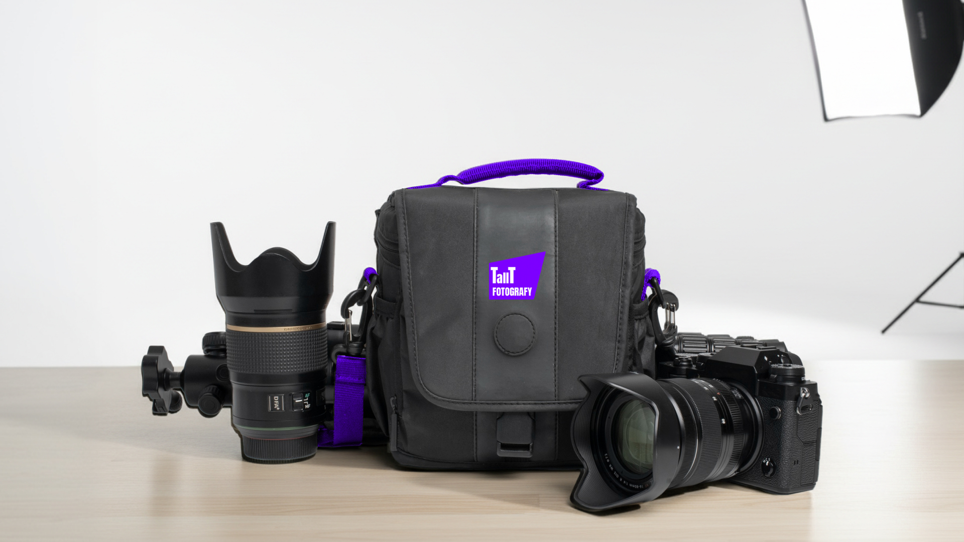
Merchandise design
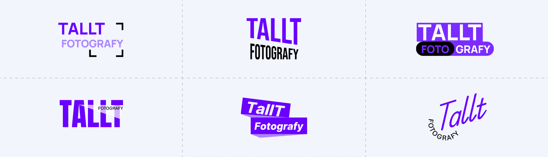
The final logo concept is built around the behavior of light in live concert environments. The form references the convergence of light rays, echoing the way stage lights and camera lenses direct and focus light toward a single point.
The geometry also reflects the flow and reflection of light, capturing the movement and energy present in concert photography. Light constantly shifts across the stage, bouncing between performers, instruments, and the surrounding atmosphere.
At the same time, the shape suggests the projection of a spotlight, a central element of live performances. Together these ideas create a mark that connects photography, light, and the atmosphere of concerts in a simple and memorable visual form.

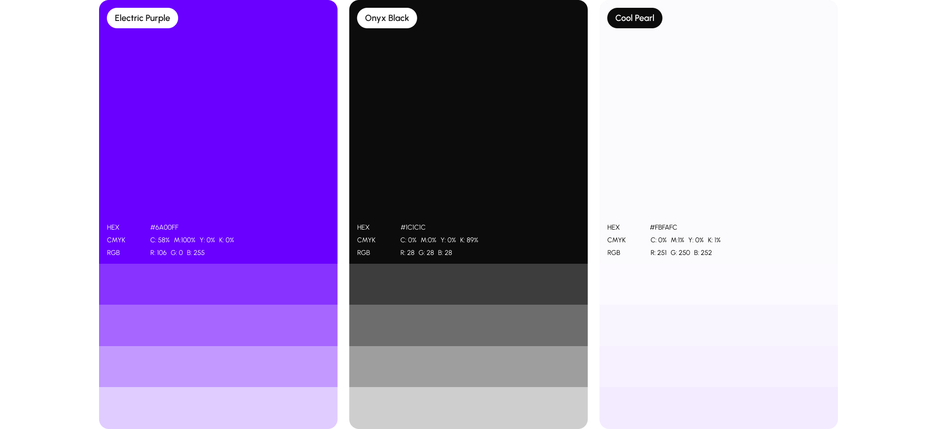
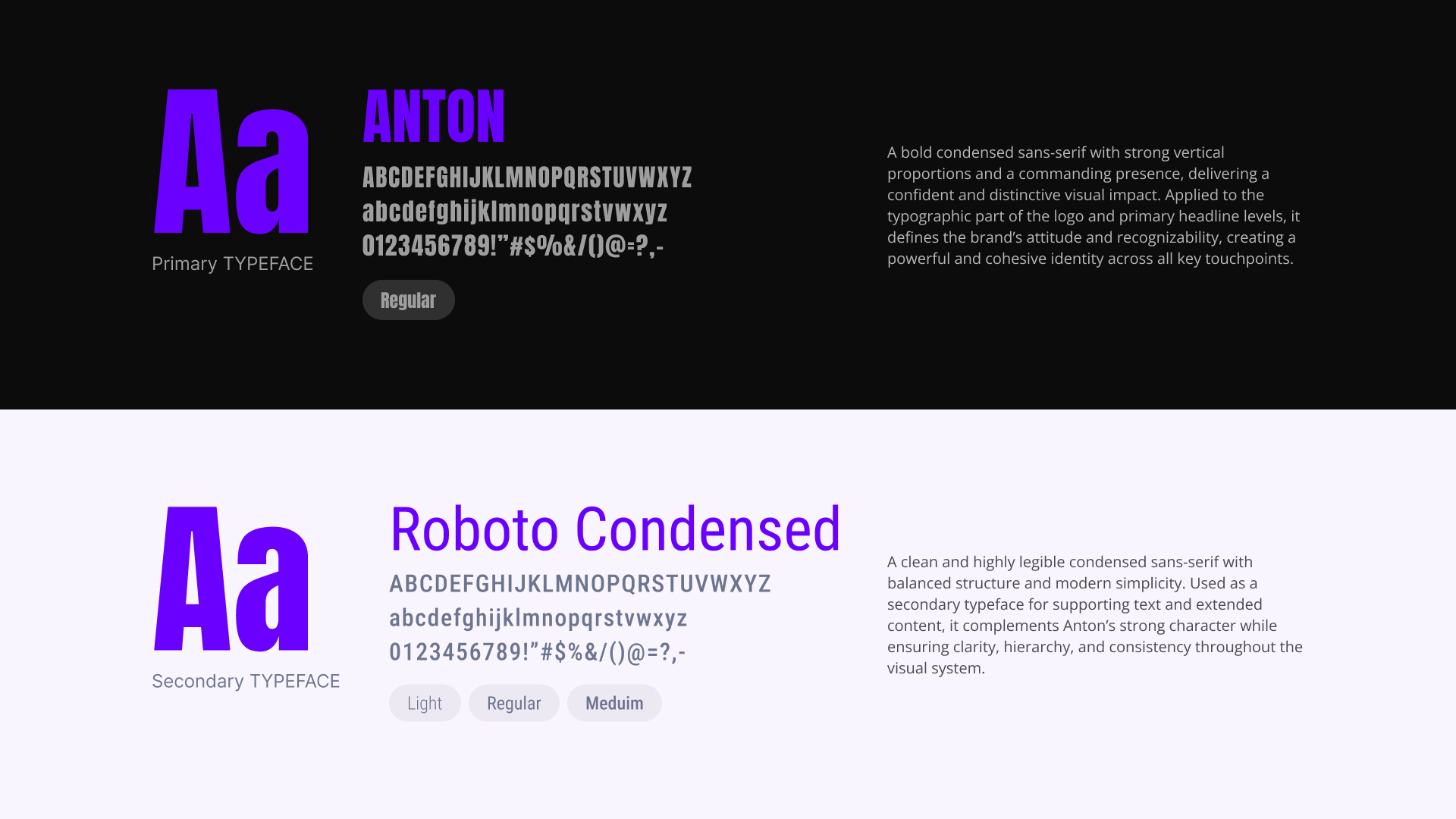
We built a color palette that reflects the atmosphere of live concerts and night photography. It balances bold expression with clarity and professionalism.
Every color has a role. Together they create a palette that captures the mood of live music while keeping the brand clear, confident, and professional.
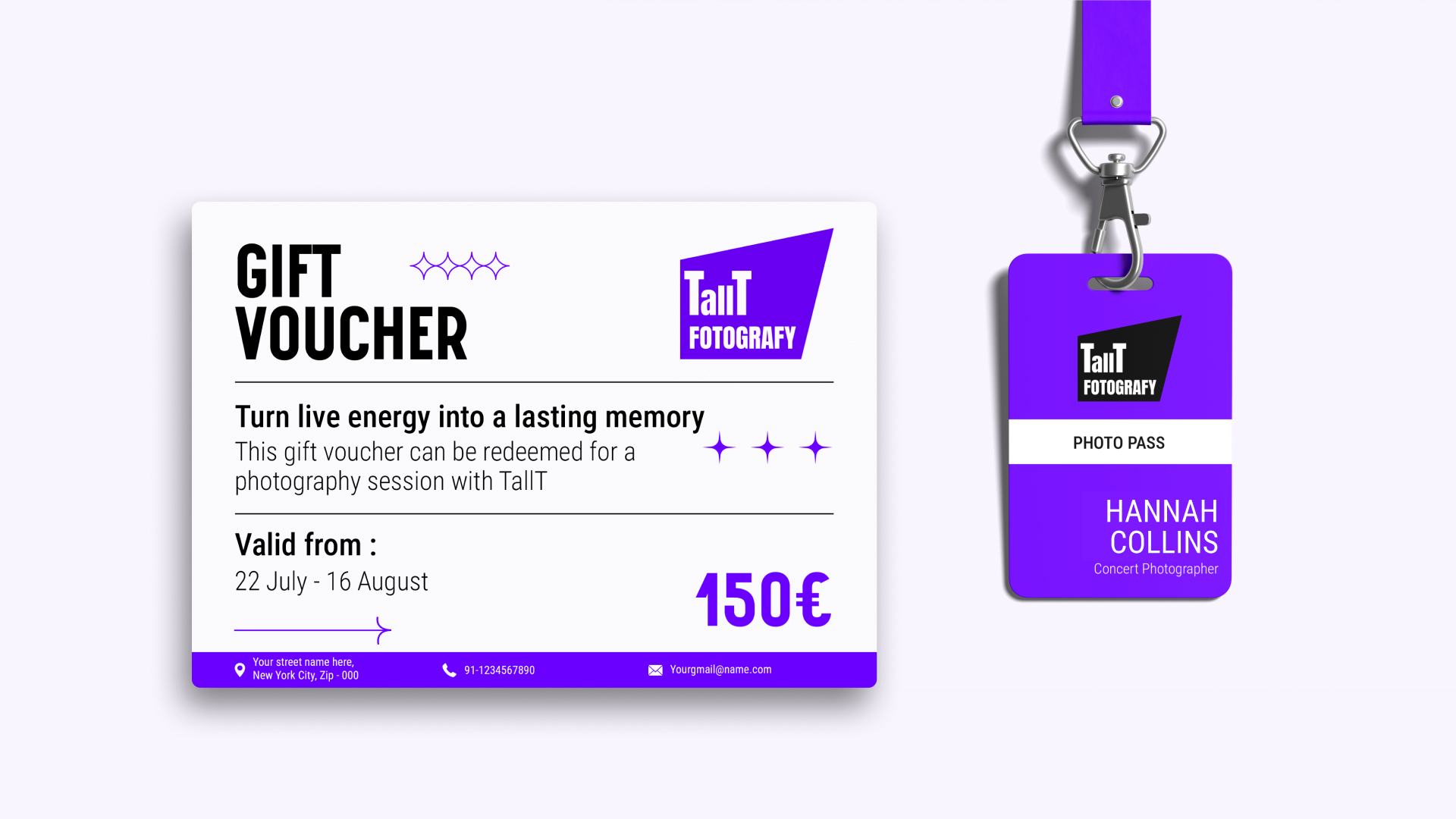
The new identity extends naturally across the photographer’s marketing materials, from concert cards and gift vouchers to social content and promotional visuals. Each asset relies on the strength of the logo and color system, creating a consistent presence that is easy to recognize across different formats.
The system focuses on clarity and atmosphere. Strong contrast, bold color, and simple layouts allow the photography and the experience of live music to remain the center of attention. The identity supports the work without overwhelming it.
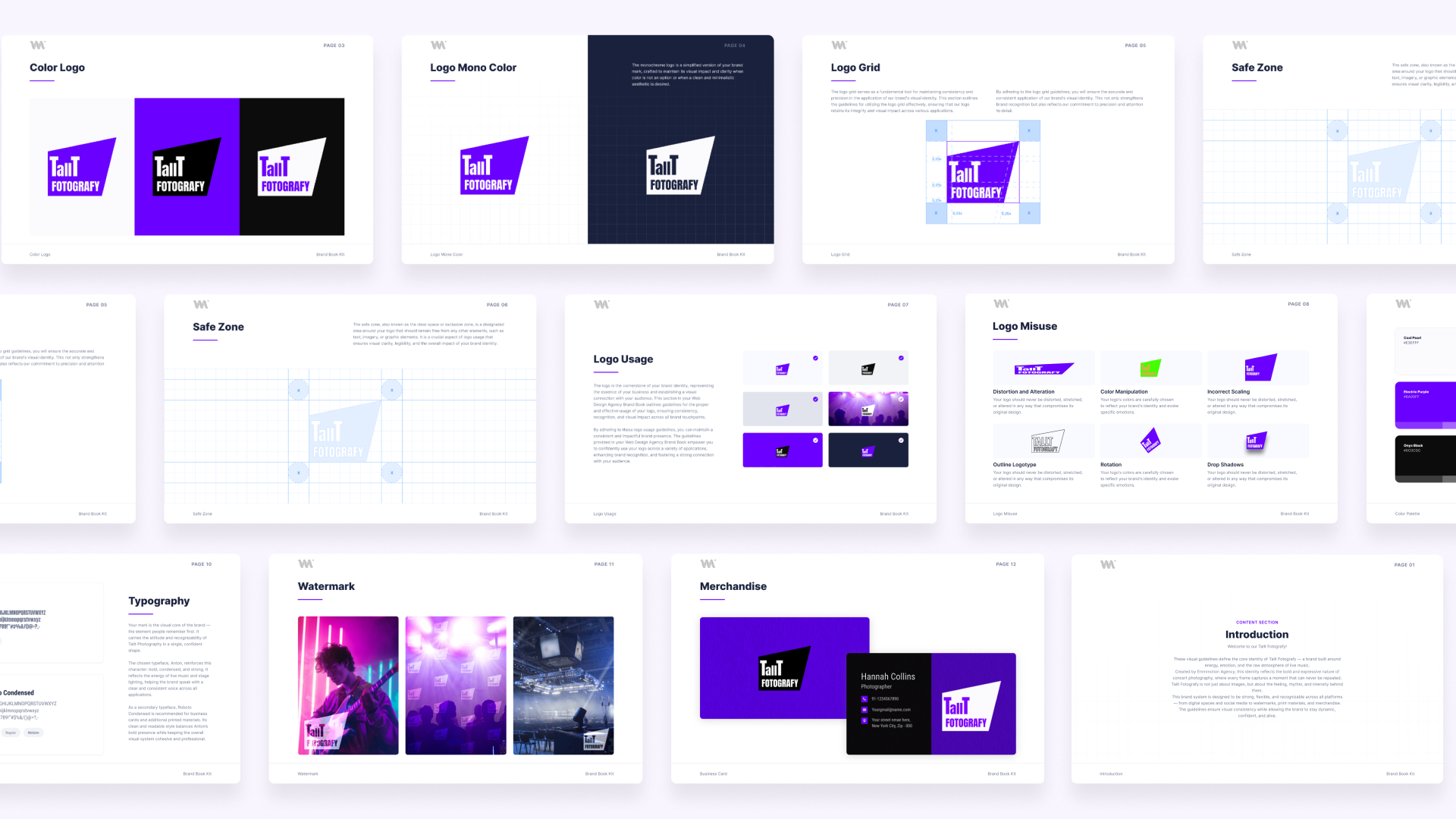
To ensure consistency, we also developed a brand style guide. It provides clear rules and visual examples for applying the logo, colors, and layouts across different materials, giving the photographer a practical toolkit to maintain a cohesive brand as her work continues to grow.

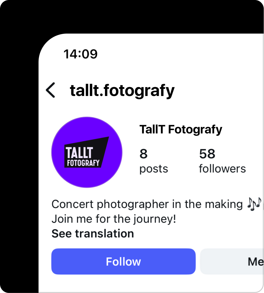
The new identity supports the photographer’s presence on social media, where most of the work is shared and discovered. Brand elements are designed to work naturally alongside photography, keeping the focus on the images while maintaining a recognizable visual presence.
The logo also functions as a watermark applied to photographs. It protects the work while reinforcing the brand whenever images are published online.
To ensure consistency, we also prepared a comprehensive brand guidelines document. It outlines how the logo, colors, and visual elements should be used across different contexts. The guide includes clear explanations and visual examples, providing a practical reference that helps maintain a consistent identity as new work and content are shared over time.
A clear brand foundation – created a professional identity that gives the photographer a strong and recognizable presence from the start.
Distinct visual character – a logo inspired by light convergence and stage lighting that connects photography with the atmosphere of live concerts.
Atmospheric color palette – introduced electric purple, onyx black, and cool pearl to reflect the mood of night performances and concert environments.
Stronger social media presence – a recognizable visual identity and logo watermark that keeps the photographer’s work identifiable across shared images.
Practical brand toolkit – comprehensive brand guidelines that provide clear rules for using the logo, colors, and visual elements as the brand grows.